
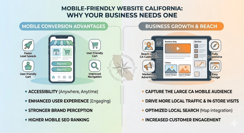
Why Every California Business Needs a Mobile-Friendly Website
If you’re looking to build a mobile-friendly website California businesses can rely on, you’re already thinking about one of the most important factors in modern web development. Today, more people browse websites on smartphones and tablets than on desktop computers. If your website isn’t optimized for mobile users, you could be losing valuable traffic, leads, and sales.
A responsive, mobile-friendly website improves user experience, helps your pages rank better in Google search results, and increases the chances that visitors will contact your business or make a purchase.
Whether you’re a local service provider, an online retailer, or a growing company, investing in a mobile-friendly website is essential for long-term success.
What Is a Mobile-Friendly Website?
A mobile-friendly website automatically adjusts its layout and content to fit different screen sizes.
Instead of forcing users to zoom in or scroll sideways, responsive websites provide a smooth experience on:
- Smartphones
- Tablets
- Laptops
- Desktop computers
A properly optimized website makes it easier for visitors to browse your content, find information, and complete important actions.
Why Mobile Optimization Matters
More than half of all internet traffic comes from mobile devices.
Customers search for businesses, compare services, and make purchasing decisions directly from their phones.
If your website is difficult to use on mobile devices, visitors are more likely to leave and choose a competitor.
A mobile-friendly website helps you:
- Improve user experience
- Increase engagement
- Reduce bounce rates
- Generate more leads
- Increase online sales
- Improve Google rankings
Google Uses Mobile-First Indexing
Google primarily evaluates the mobile version of your website when determining search rankings. If your website performs poorly on smartphones and tablets, it can negatively impact both user experience and your visibility in search results.
A mobile-friendly website provides faster loading times, easier navigation, responsive layouts, and a better overall experience for visitors across all devices. These improvements help reduce bounce rates, increase engagement, and support stronger search performance.
According to Google Search Central, mobile-first indexing means Google predominantly uses the mobile version of a website for indexing and ranking purposes. This is why mobile optimization has become an essential component of every successful SEO strategy.
Businesses looking to improve their online visibility often combine mobile optimization with professional SEO Services California to enhance search rankings, attract qualified traffic, and deliver a better experience for their customers.
Benefits of a Mobile-Friendly Website
Better User Experience
Visitors expect websites to load quickly and display correctly on every device.
A responsive design improves:
- Navigation
- Readability
- Accessibility
- Customer satisfaction
Happy visitors are more likely to become customers.
Improved Search Rankings
Google rewards websites that provide an excellent mobile experience.
A responsive website supports:
- Higher rankings
- Better indexing
- Improved Core Web Vitals
- Increased organic traffic
Mobile optimization works hand in hand with SEO.
Faster Website Performance
Website speed directly impacts conversions.
A professionally optimized website includes:
- Compressed images
- Clean code
- Browser caching
- Optimized CSS and JavaScript
- Fast hosting
A faster website creates a better experience for both users and search engines.
Higher Conversion Rates
When visitors can easily browse your website, they’re more likely to:
- Request a quote
- Fill out a contact form
- Call your business
- Purchase a product
- Book an appointment
Even small improvements in usability can significantly increase conversions.
Essential Features of a Mobile-Friendly Website
Every modern business website should include:
Responsive Layout
Your content should automatically adjust to every screen size.
Fast Loading Pages
Visitors expect pages to load in just a few seconds.
Optimizing speed improves both SEO and user satisfaction.
Easy Navigation
Menus should be simple, organized, and easy to use on smaller screens.
Clickable Buttons
Buttons should be large enough for users to tap comfortably without accidental clicks.
Readable Text
Visitors should never need to zoom in to read your content.
Optimized Images
Images should maintain quality while loading quickly on mobile devices.
Common Mobile Website Mistakes
Many businesses unintentionally create poor mobile experiences.
Common mistakes include:
- Small text
- Slow loading pages
- Unresponsive layouts
- Large image files
- Broken buttons
- Pop-ups covering content
- Poor navigation
- Tiny contact forms
Avoiding these issues improves both SEO and customer satisfaction.
Why WordPress Is Great for Mobile Websites
WordPress makes it easier to build responsive websites using modern themes and development practices.
Professional WordPress development ensures:
- Responsive design
- Better performance
- Easy content management
- SEO-friendly structure
- Long-term scalability
WordPress Development California
Mobile Optimization and eCommerce
For Shopify and eCommerce businesses, mobile optimization directly affects revenue.
Customers often browse and purchase products from their phones.
An optimized Shopify store provides:
- Faster product pages
- Easier checkout
- Better navigation
- Improved conversion rates
Shopify Development California
Mobile Websites Generate More Leads
A mobile-friendly website supports every stage of the customer journey by making it easy for visitors to interact with your business from any device. As more users browse, research, and make purchasing decisions on smartphones and tablets, mobile usability has become essential for driving conversions.
Visitors should be able to contact your business, schedule appointments, request quotes, download resources, and complete purchases without encountering obstacles or usability issues. A seamless mobile experience helps build trust, keeps users engaged, and encourages them to take action.
When customers can easily navigate your website and complete important actions on mobile devices, businesses are more likely to generate qualified inquiries and conversions. That’s why many companies combine mobile optimization with professional Lead Generation Services California to turn website traffic into measurable business growth and long-term customer relationships.
Why Choose Webex Marketing Technology?
At Webex Marketing Technology, we develop responsive websites designed for performance, SEO, and business growth.
Our services include:
- Responsive WordPress development
- Shopify development
- Website redesign
- Mobile optimization
- Technical SEO
- Speed optimization
- Conversion optimization
- Website maintenance
We build websites that look professional and perform exceptionally on every device.
Frequently Asked Questions
What is a mobile-friendly website?
A mobile-friendly website automatically adapts to smartphones, tablets, laptops, and desktop computers for a better user experience.
Does mobile optimization improve SEO?
Yes. Google uses mobile-first indexing, making mobile optimization an important ranking factor.
Why is responsive design important?
Responsive design ensures visitors can easily navigate and interact with your website on any device.
Can a mobile-friendly website increase sales?
Yes. Better usability often leads to higher engagement, improved conversions, and increased online sales.
How often should a website be updated?
Regular updates improve security, performance, compatibility, and overall user experience.
Final Thoughts
Building a mobile-friendly website California businesses can depend on is no longer optional—it’s essential. A responsive website improves user experience, supports better Google rankings, increases conversions, and helps your business stay competitive in today’s digital marketplace.
Whether you’re launching a new website or upgrading an existing one, investing in mobile optimization provides long-term value for your business and your customers.
If you’re ready to create a responsive, SEO-friendly website, Webex Marketing Technology is here to help.
Call to Action
Is your website providing the best experience for mobile users?
With most online searches now happening on smartphones and tablets, a mobile-friendly website is essential for attracting customers, improving search rankings, and increasing conversions. A responsive, fast-loading website helps visitors easily browse your content, contact your business, and take action from any device.
Contact us today on WhatsApp for a free consultation and let our experts help you create a mobile-friendly website that enhances user experience, improves SEO performance, and helps your California business generate more leads and grow online.